Introducing Righ’s New Look

We are excited to showcase Righ’s new look.
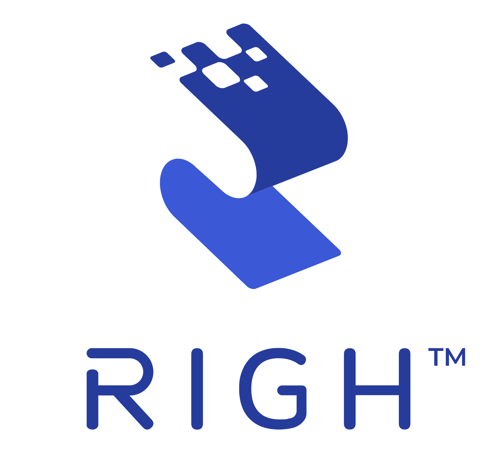
At its core, the icon is a bold letter R, standing strong and independent.
Its flowing form conveys movement, signaling that information is always in motion—gathered, refined, and made more useful through Righ’s agentic AI platform.
The data pieces woven within the design represent the building blocks of insights. Their deliberate placement reflects privacy and protection—indicating that information is never scattered or exposed, but securely held and transformed into clarity.
Our refreshed colors embody the core qualities of Righ. Blue speaks to trust, intelligence, and stability. Pink adds a spark of boldness and creativity. Gold, true to our name’s Gaelic meaning of “royal,” highlights excellence and high standards.
A heartfelt thank you to our in-house designer, Paula Chuang, who translated this vision into an icon that feels modern, confident, and uniquely Righ.


